Do photos work on architect’s web sites?
Are your photos helping your architectural web site?
Are your images working against you?
We’ve all seen stunning photos of award winning projects in architectural magazines.
They are used to tell a story and showcase features and aspirations of the design. Many hours set-up work and staging may have gone into just two or three photographs.
But, what about that home extension or re-modelling that makes up so much of the work of ‘real working architects’ in smaller practices – how do you show that?
This post follows on from a lengthy article I wrote on our main site, after an interview with a marketing agency:
Photos on architect’s web sites:
How many clients did you lose before you even met them?
What is your web site for?

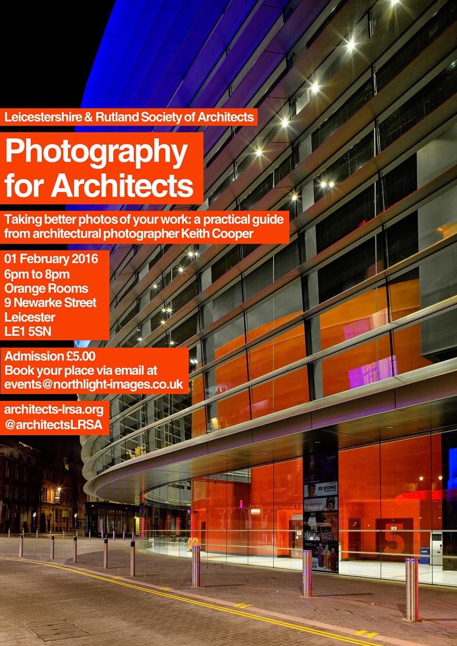
Earlier this year I gave a presentation for local practices about effective use of photography, with an emphasis on taking better photos themselves.
I know some photographers regard this as strange, but in the real world an awful lot of projects don’t have the budget for extensive professional photography. There is also the matter of recording works progress and documenting projects.
I sit on the Council of the Leicestershire & Rutland Society of Architects, as an affiliate member of RIBA and apart from helping with the Pub Quiz, get to talk with a lot of smaller practices about different aspects of the business of architecture, from training to marketing.
Some of my thoughts regarding just how architects can market their services also come from being Vice Chair of the Leicester branch of the Federation of Small Businesses – a national (UK) business organisation.
During the course of preparing for the presentation, both Karen and myself looked through a lot of UK architect’s web sites and it was often a somewhat dispiriting process, with a steady stream of badly lit examples of work, often leaning at alarming angles, sometimes strewn with building waste.
The question has to be what are photos like this doing on a web site?
If the web site is anything more than a simple brochure page, it has a job to do for your practice, and that is showcase your skills and experience.
You might see a particularly clever solution to a building design problem and innovative use of materials – A potential client may just see a dimly lit small room with paint tins in the corner.
Such web sites are more than just a marketing tickbox – they need to earn their keep.
“Photos make a significant difference to whether the web site visitor contacts the architect or not
…bad images will cost you lost business. “
Showing features to sell an idea
One problem I share with many architects is that I have no difficulty whatsoever visualising objects and their relationships in 3D space.
Why is this a problem? It’s because it comes so naturally that you forget it’s not a universal skill.
Any images you use need to help tell a story – one that means something to the audience. Get a non architect to look at your copy and photos – what do they see?
Think of any photo as having a number of potential jobs to do – these vary with location on your web site.
- A photo has to grab viewers initial attention and hold them on a page long enough for the copy to register.
- If you’re selling aspirational design, it has to resonate with potential clients, setting the right mood.
- The photo needs to exude confidence and relevance to the visitors’ needs.
- If the photo is illustrating technical competence, it needs to be technically competent in itself
For a profession where initial visual impact is such an important consideration, all too many architects seem to think that potential clients will see past glaring imperfections in photos and appreciate the essential skills underneath.
“Do poor quality photos potentially reflect the care and attention you’ll give to clients?”
Better photos for you
Whilst you’d expect me to suggest engaging us to work for you, I know that’s not going to happen for a lot of smaller projects.
Because of this we offer tailor made training sessions and courses for architectural practices – they are bespoke, fitted to the needs and size of your practice (however big or small).
Also, do have a read of “Photos on architect’s web sites: How many clients did you lose before you even met them?” where I look at many other areas that are important for a web site to actively contribute to business, and include a number of practical tips you can use for improving the quality of your own photography. You might want to consider our own ‘guidelines for commissioning architectural photography‘ to see some of the things we we look for, before taking any photos.
Does the message I’ve tried to convey here ring some bells? Please do give me a call and see how we can help.


